

As a Flutter developer, you should get familiar with the term 'SCAFFOLD' because this is first thing you seeing any basic flutter app. You may be wondering what is Scaffold? Why is it so important in Flutter?
Not to be confused with Scaffold in building construction
Scaffolds are widgets in Flutter that are used to implement basic layout structures. A Scaffold widget fills the available screen in an app, it also provides access to different APIs like appbar, drawers and a lot more.
Let's explore the Scaffold widget by looking at its constructor.
Scaffold({
 Key? key,
  this.appBar,
  this.body,
  this.floatingActionButton,
  this.floatingActionButtonLocation,
  this.floatingActionButtonAnimator,
  this.persistentFooterButtons,
  this.drawer,
  this.onDrawerChanged,
  this.endDrawer,
  this.onEndDrawerChanged,
  this.bottomNavigationBar,
  this.bottomSheet,
  this.backgroundColor,
  this.resizeToAvoidBottomInset,
  this.primary = true,
  this.drawerDragStartBehavior = DragStartBehavior.start,
  this.extendBody = false,
  this.extendBodyBehindAppBar = false,
  this.drawerScrimColor,
  this.drawerEdgeDragWidth,
  this.drawerEnableOpenDragGesture = true,
  this.endDrawerEnableOpenDragGesture = true,
  this.restorationId,
 })
Now let's take a look at each item
key
A key in flutter is used to identify and preserve the state of a widget as they move around the widget tree.
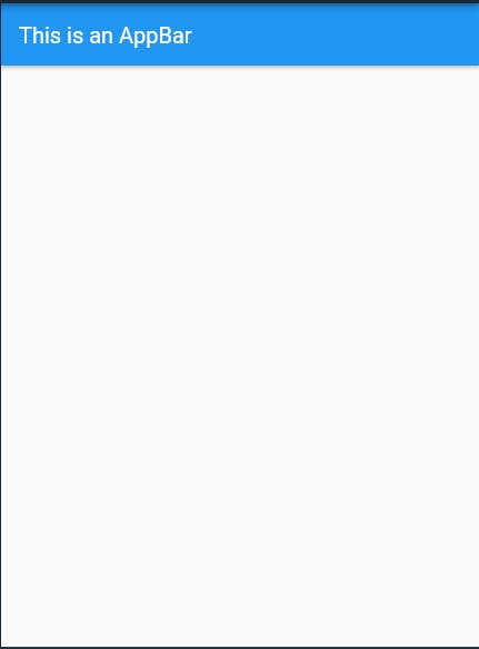
appBar
The appBar property takes an AppBar widget, which is a horizontal bar on the top of the screen, it also has various properties like title, actions, pop up menu and so on, which we will be exploring later.
 @override
  Widget build(BuildContext context) {
    return Scaffold(
      appBar: AppBar(
        title: Text('This is an AppBar'),
      ),
    );
  }
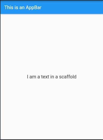
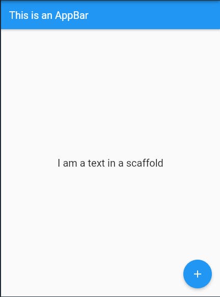
body
This body displays the main content of the app on the screen, it is usually placed below the appBar. Inside the body property, you can design and customize your app.
 @override
  Widget build(BuildContext context) {
    return Scaffold(
      appBar: AppBar(
        title: const Text('This is an AppBar'),
      ),
       body: const Center(
          child: Text(
        "I am a text in a scaffold",
        style: TextStyle(fontSize: 20.0),
      )),

    );
  }
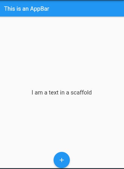
floatingActionButton
As we can guess from the word the floatingActionButton is a button that floats over the contents of the body property at a fixed place, so if we use the floatingActionButton and we scroll the page to the position where the floatingActionButton is it won't move or change it's possible because it is fixed.
 @override
  Widget build(BuildContext context) {
    return Scaffold(
      appBar: AppBar(
        title: const Text('This is an AppBar'),
      ),
       body: const Center(
          child: Text(
        "I am a text in a scaffold",
        style: TextStyle(fontSize: 20.0),
      )),
       floatingActionButton: FloatingActionButton(
        onPressed: () {},
        child: const Icon(Icons.add),
      ),

    );
  }
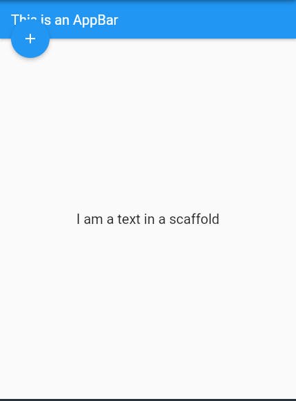
floatingActionButtonLocation & floatingActionButtonAnimator
floatingActionButtonLocation is the property responsible for the location of the floatingActionBotton on the screen. While the floatingActionButtonAnimator gives animation to the floatingActionButton when it is moved.
But you said the floatingActionButton can't move?
Yes, it can't move on its own however there are some instances where when the user interacts with the app they can make it move.
floatingActionButtonLocation: FloatingActionButtonLocation.centerDocked
floatingActionButtonLocation: FloatingActionButtonLocation.startTop
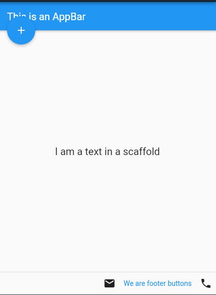
persistentFooterButtons
This is a set of buttons that are displayed at the bottom of the scaffold. Just like the floatingActionButton they are always visible even if the body of the scaffold scrolls.
 @override
  Widget build(BuildContext context) {
    return Scaffold(
      appBar: AppBar(
        title: const Text('This is an AppBar'),
      ),
       body: const Center(
          child: Text(
        "I am a text in a scaffold",
        style: TextStyle(fontSize: 20.0),
      )),
       floatingActionButton: FloatingActionButton(
        onPressed: () {},
        child: const Icon(Icons.add),
      ),
      floatingActionButtonLocation: FloatingActionButtonLocation.startTop,
       persistentFooterButtons:  <Widget>[
       const Icon(Icons.mail),
       TextButton(
           onPressed:(){},
         child: const Text('We are footer buttons')),
       const Icon(Icons.phone),
      ],

    );
  }
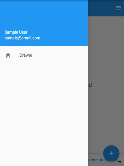
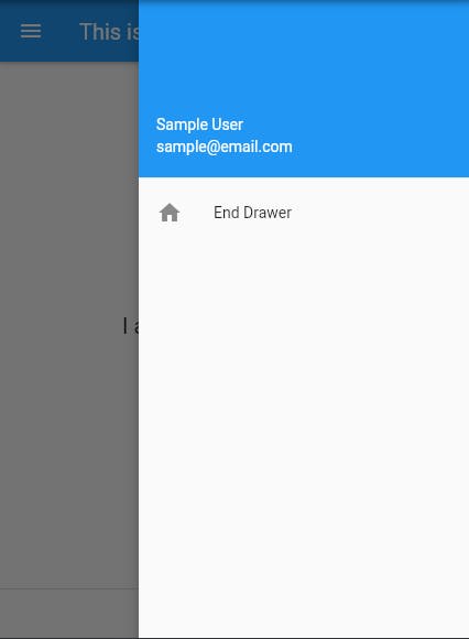
drawer & endDrawer
drawer and endDrawer are slider menus that are displayed at the side of the Scaffold. The user has to swipe left to right or right to left according to the action defined to access the drawer menu. In the Appbar, an appropriate icon for the drawer is set automatically at a particular position. The gesture to open the drawer is also set automatically. It is handled by the Scaffold.
  drawer: Drawer(
        child: Column(
          children:  <Widget>[
            UserAccountsDrawerHeader(
              accountEmail: Text("sample@email.com"),
              accountName: Text("Sample User"),

            ),
            ListTile(
              title:  Text("Drawer"),
              leading:  Icon(Icons.home),
            ),
          ],
        ),

      ),
       endDrawer: Drawer(
        child: Column(
          children:  <Widget>[
            UserAccountsDrawerHeader(
              accountEmail: Text("sample@email.com"),
              accountName: Text("Sample User"),

            ),
            ListTile(
              title:  Text("End Drawer"),
              leading:  Icon(Icons.home),
            ),
          ],
        ),

      ),
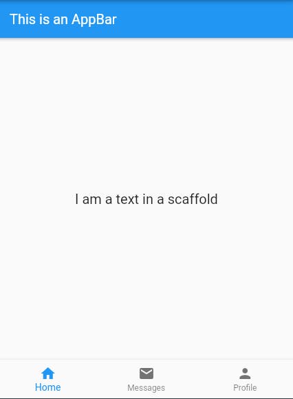
bottomNavigationBar
It is a menu at the bottom of the screen that is used to display navigation widgets, it can range from 3-5 widgets.
bottomNavigationBar: BottomNavigationBar(
        currentIndex: 0,
        items: [
          BottomNavigationBarItem(
            icon: Icon(Icons.home),
            title: Text('Home'),
          ),
          BottomNavigationBarItem(
            title: Text('Messages'),
            icon: Icon(Icons.mail),
          ),
          BottomNavigationBarItem(
              icon: Icon(Icons.person), title: Text('Profile'))
        ],
      ),
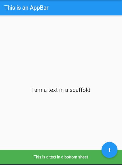
bottomSheet
This is a widget at the bottom of the screen that remains visible even as the user interacts at the other parts of the screen.
 bottomSheet: Container(
        color: Colors.green,
        height: 50,
        child: Center(
            child: Text(
          "This is a text in a bottom sheet",
          style: TextStyle(color: Colors.white),
        )),
      ),
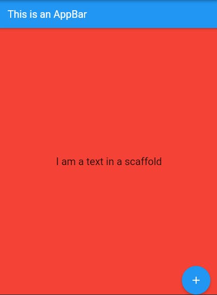
backgroundColor
This is used to set the background colour of the scaffold.
 @override
  Widget build(BuildContext context) {
    return Scaffold(
      backgroundColor: Colors.red,
resizeToAvoidBottomPadding
This is the deprecated property, that is replaced by resizeToAvoidBottomInset;
resizeToAvoidBottomInset
This help to resize the screen when the keyboard is opened when the value is set to true.
primary
It is used to tell whether the Scaffold will be displayed at the top of the screen or not.
drawerScrimColor
This is used to define the colour that obscures primary content while a drawer is open
drawerDragStartBehaviour
This is used to determine the drag behaviour of the drawer.
drawerEdgeDragWidth
The width of the area within which a horizontal swipe will open the drawer.
drawerEnableOpenGesture && endDrawerEnableOpenGesture
This determines if the Scaffold drawer can be opened with a drag gesture.
extendBody
If it is set to true and there is a bottomNavigationBar or persistentFooterButtons in the scaffold, then the height of these is added to the body and they are shifted beneath the body.
extendBodyBehindAppBar
If true, and an appBar is specified, then the height of the body is extended to include the height of the app bar and the top of the body is aligned with the top of the app bar.
onDrawerChanged && onEndDrawerChanged
This is an optional callback that is called when the Scaffold drawer is opened or closed.
restorationId
This is the restoration ID to save and restore the state of the Scaffold.